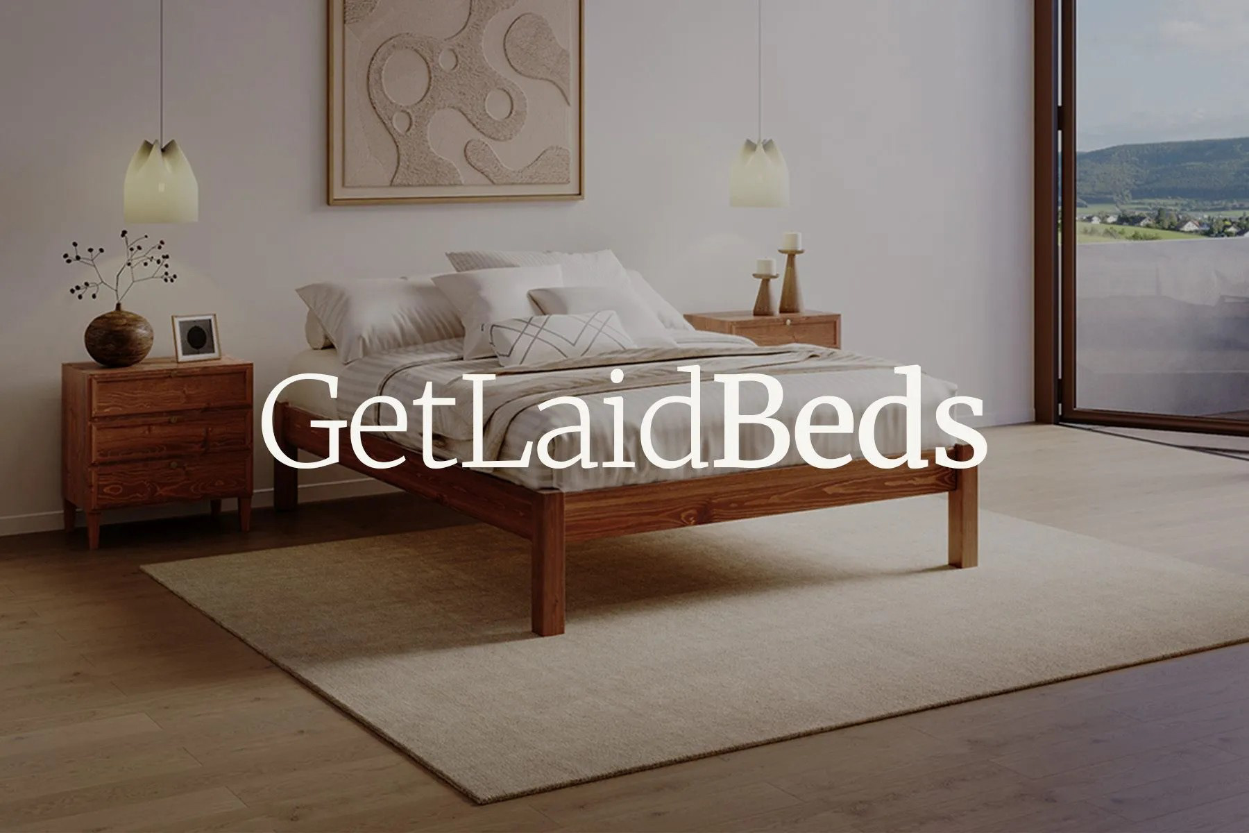
This project was about bringing Get Laid Beds into a more refined, modern space while keeping its approachable tone. The company’s old logo felt a bit dated, especially compared to the clean look of today’s luxury interiors and ecommerce brands.
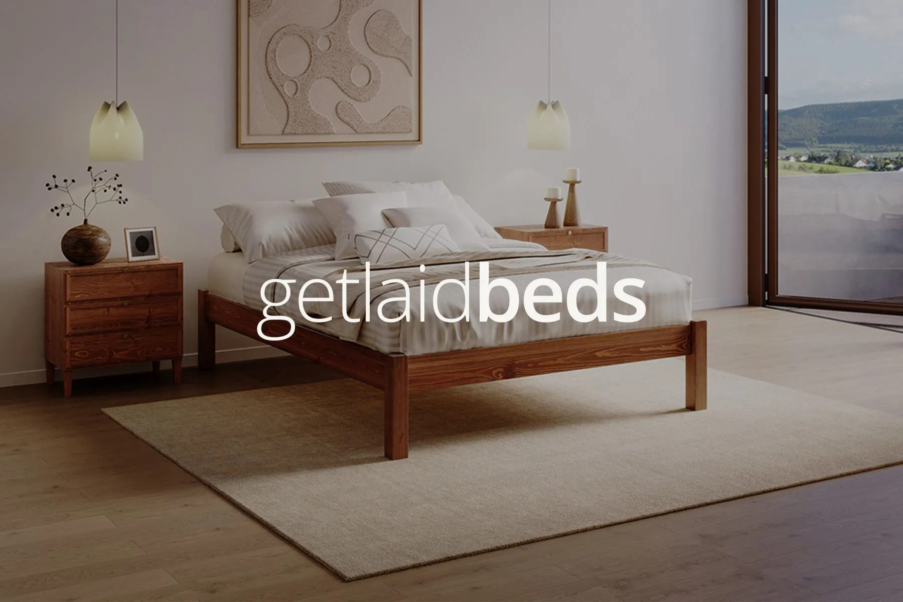
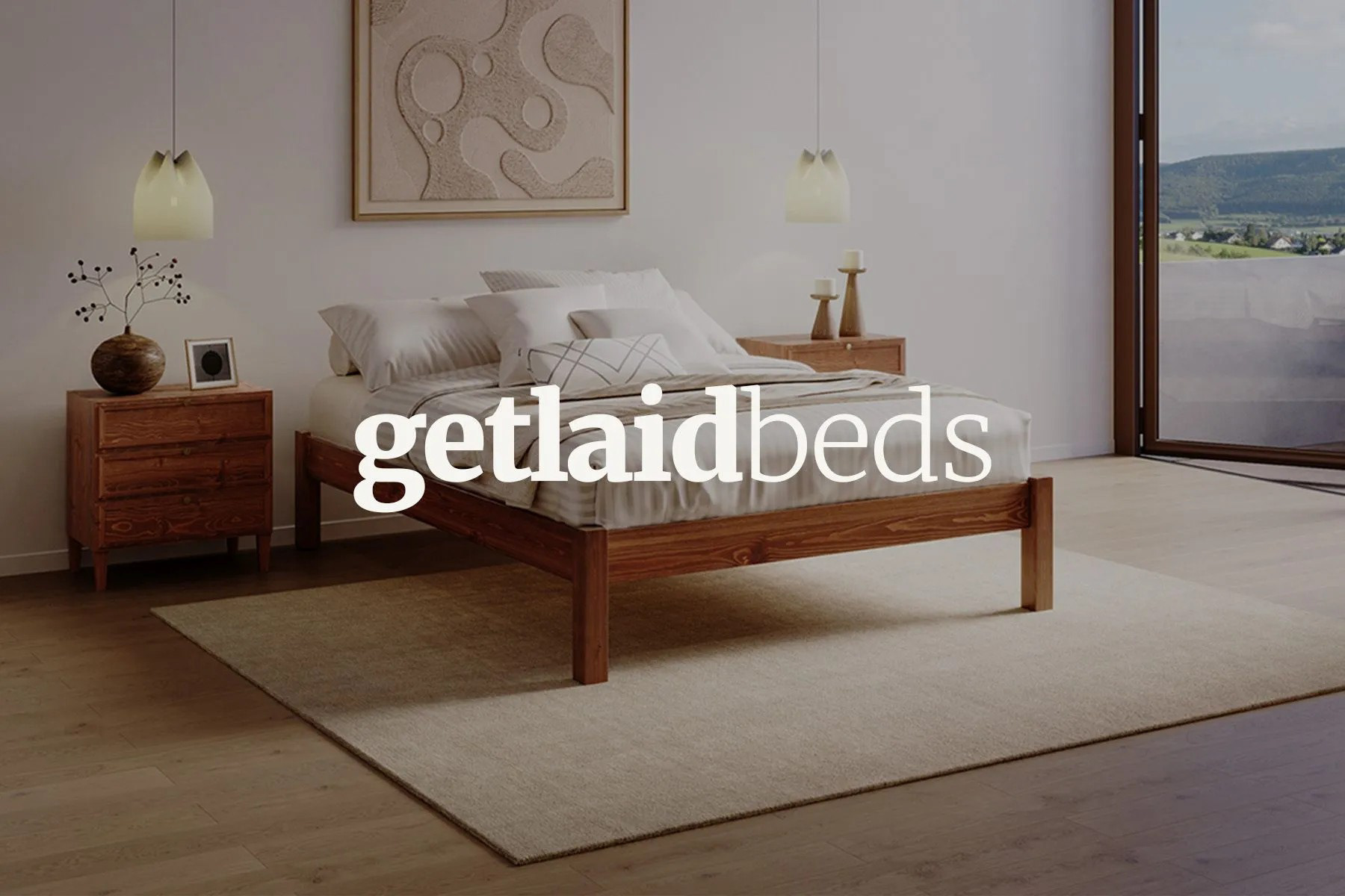
I explored a few wordmark variations using the brand’s existing typefaces, Merriweather and Open Sans, to find a balance between warmth and sophistication. The lowercase treatment felt calm and confident, while still friendly and easy to read.
The result is a minimal logo that fits naturally across digital and print, giving the brand a more contemporary, design-led feel without losing its personality.