Get Laid Beds has a strong product story. Every bed is handmade. Every finish is real wood. Every size and style can be customised. What the brand didn’t have was a website that made any of that feel simple or inspiring. The original experience was very dated, almost early 2000s in style, with long stacked menus, inconsistent pages, and no clear user flow. It struggled to compete with modern furniture brands who were presenting themselves in a clean, editorial, interior design style.

Navigation Design
The redesign started with the structure. I rebuilt the entire navigation system so customers could explore by the way they naturally shop. Collections, sizes, finishes, mattresses, bedding, accessories, and storage all became clear paths rather than long lists. The mega menus were rebuilt to surface the most important categories instantly and to display real products instead of plain text. This helped users make faster choices and stay engaged. When selected these mega menus would transition out from the sticky Nav bar.
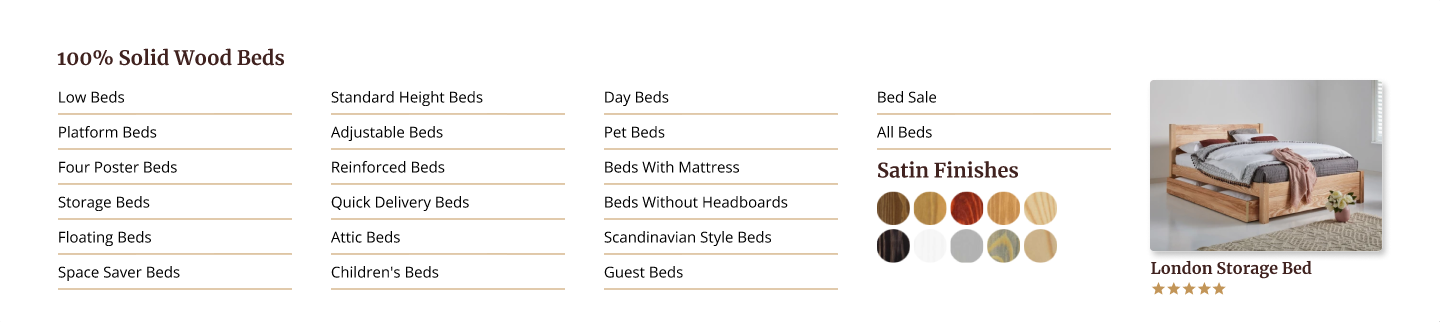
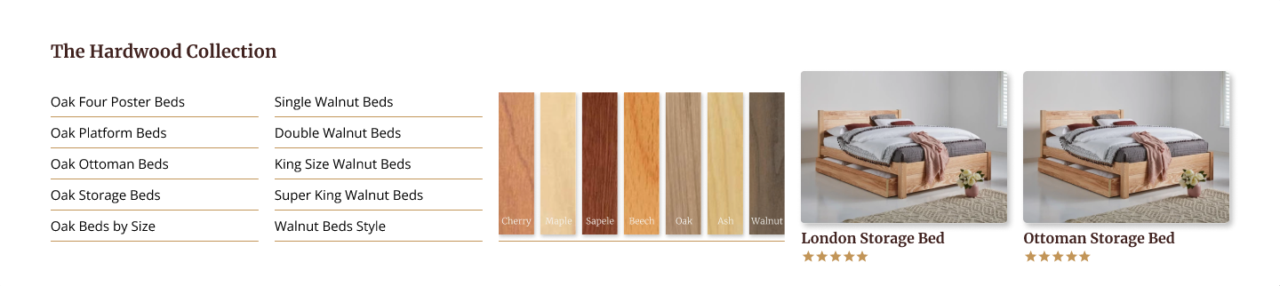
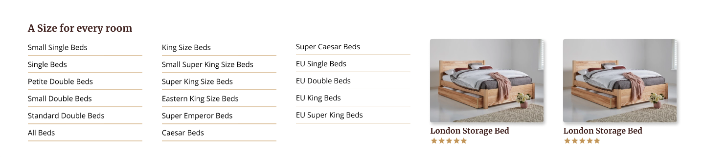
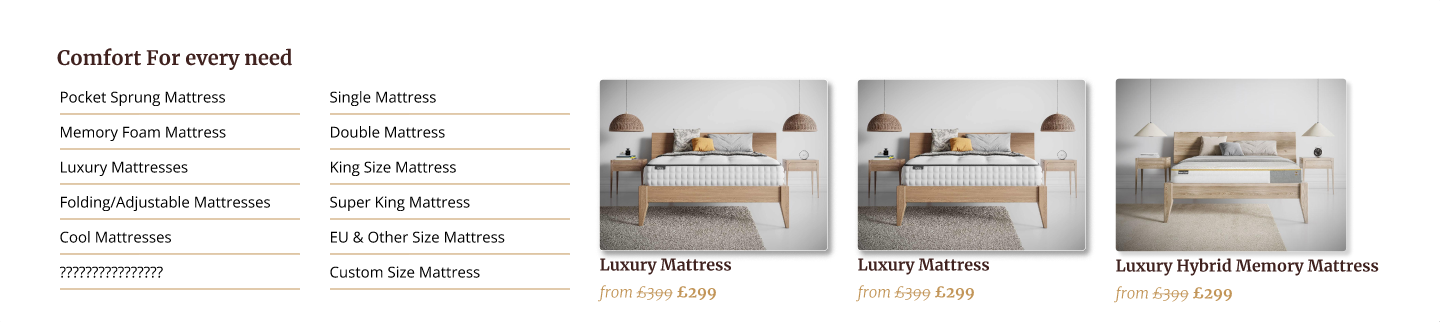
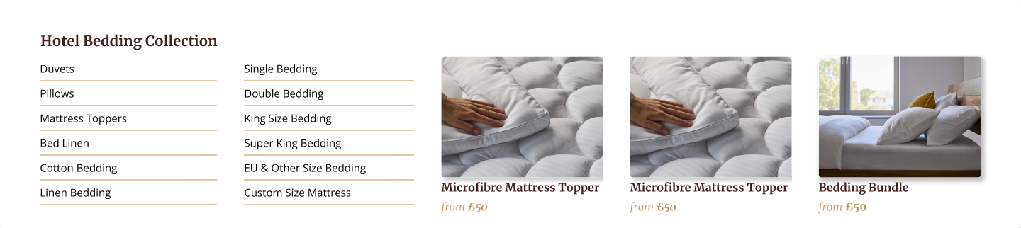
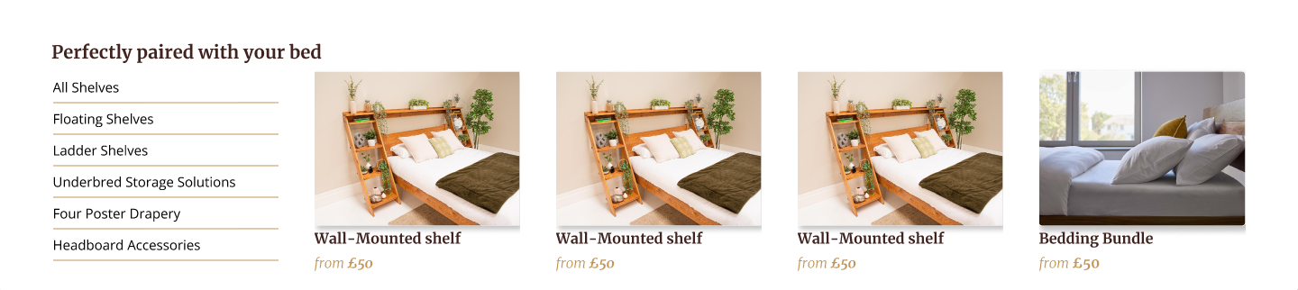
Navigation MegaMenu Panels
One major challenge: the content and nav links had to stay unchanged. That meant I couldn’t reduce what was there - but instead had to make it feel lighter and easier to scan by restructuring layout, spacing and hierarchy.
A major improvement came from breaking old long vertical blocks into cleaner, sideways scrolling containers. The old site forced users to scroll for miles on mobile before reaching anything useful. The redesigned structure keeps the experience quick, modern, and much more intuitive on small screens.
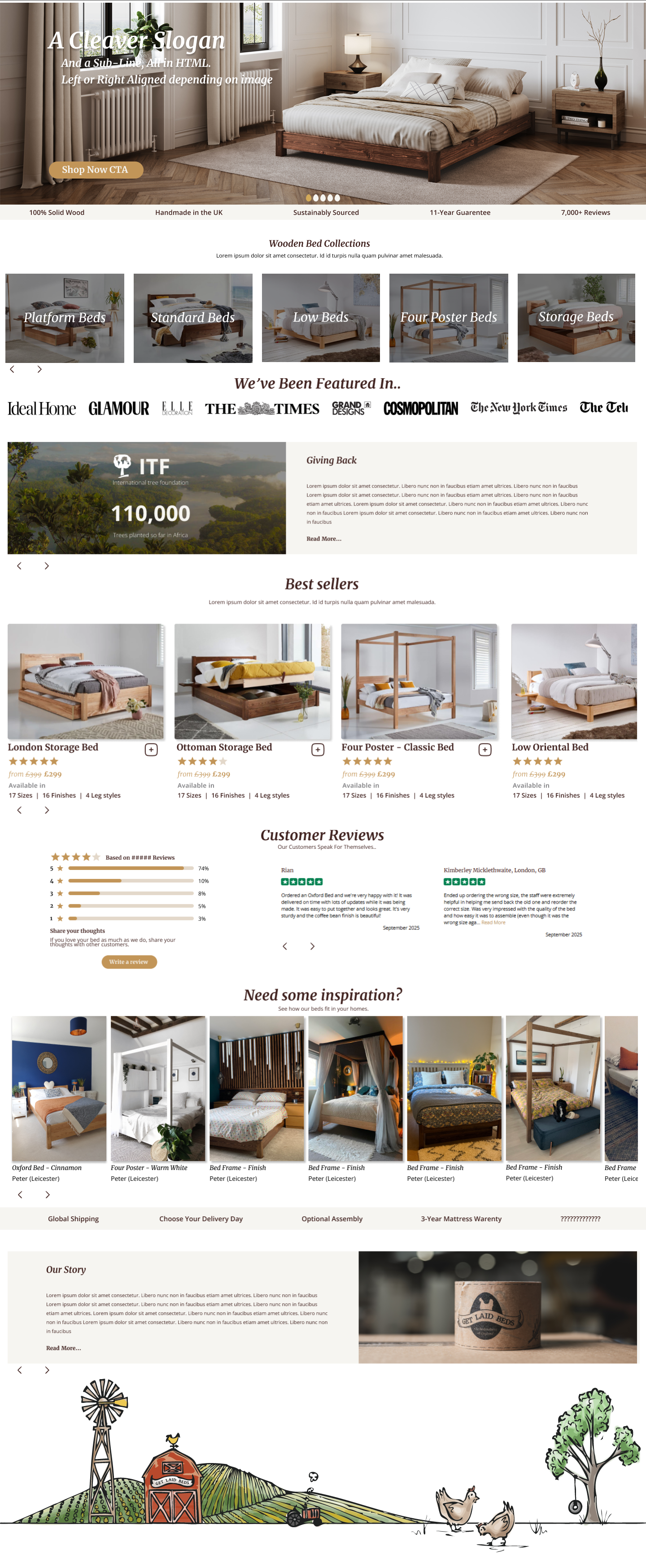
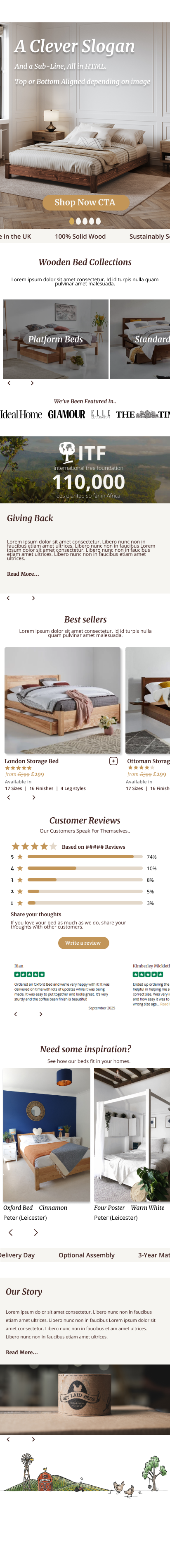
Modern. Clean - and all the important Products, Categories, Reasons to buy, Messaging are above the fold.
Next up the PDP (Product Display Page)
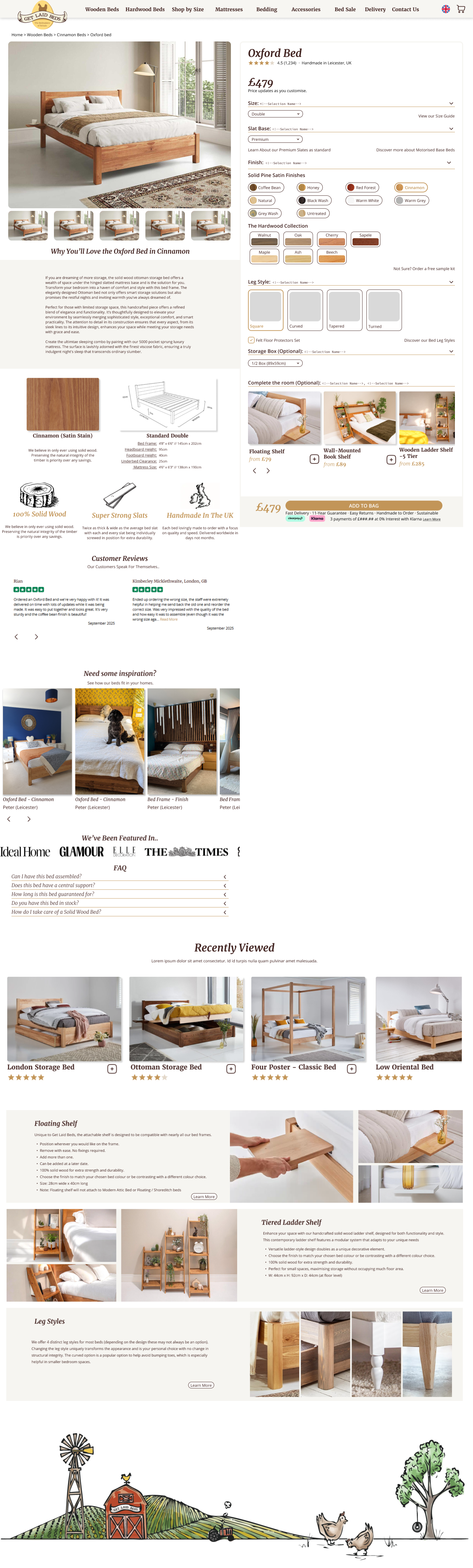
The original PDP had the basics but felt clunky and dated. The configurator sat in the right column, but nothing around it reacted to what customers selected. Images didn’t update, dimensions stayed static, and the page forced users through long blocks of content before anything felt clear.
The redesigned page fixes all of that. The configurator stays on the right, but now it’s clean, modern, and sticky, so the add to basket section is always visible no matter how far you scroll. Every option updates the page instantly. Choose a wood type and all product images switch to that finish. Pick a size and the dimensions guide adapts automatically. Even the inspiration gallery and user photos react to the customer’s selections, making the page feel personal instead of generic.
The rest of the layout was rebuilt to reduce noise and make the page easier to understand at a glance. Large lifestyle images, tidy option groups, simplified typography, and structured sections replace the old scrolling wall of information. It’s the same content and the same backend logic, but presented in a way that feels far more intuitive and far more modern.